This project is unimaginable revamp and levitation to a traditional tissue supply company based in HK.
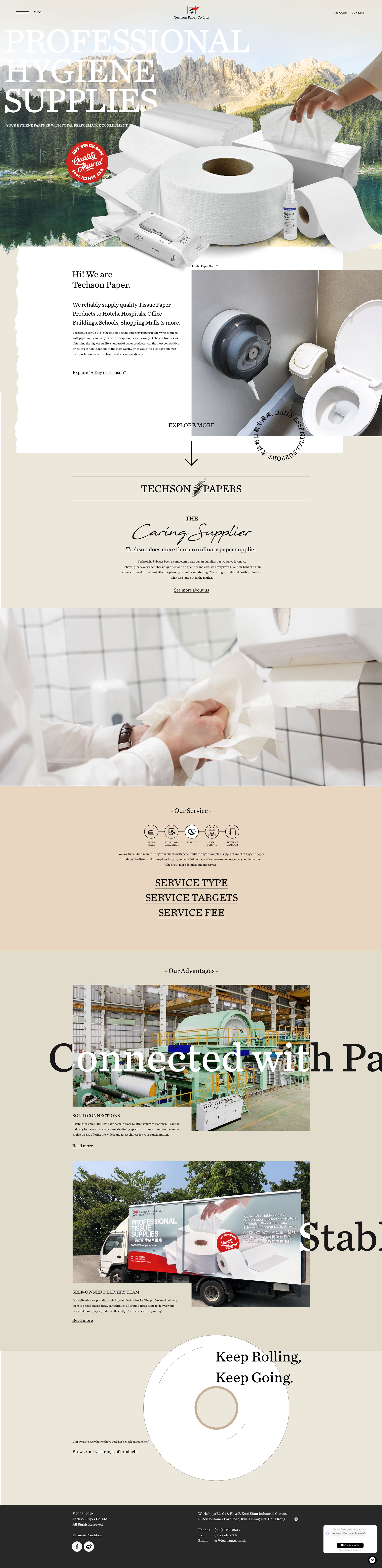
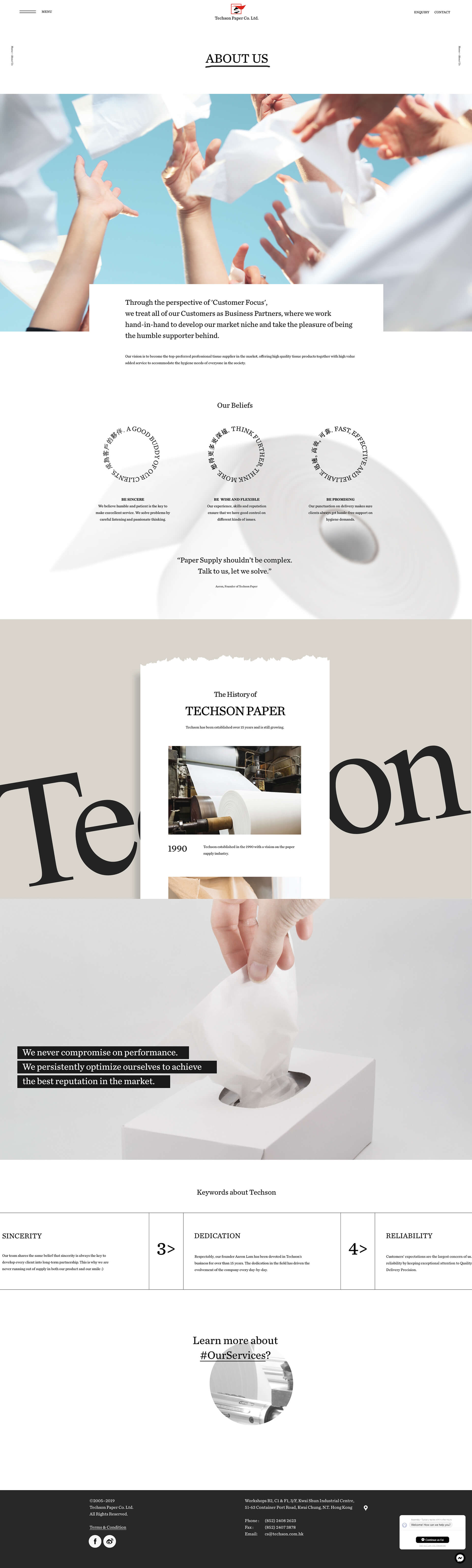
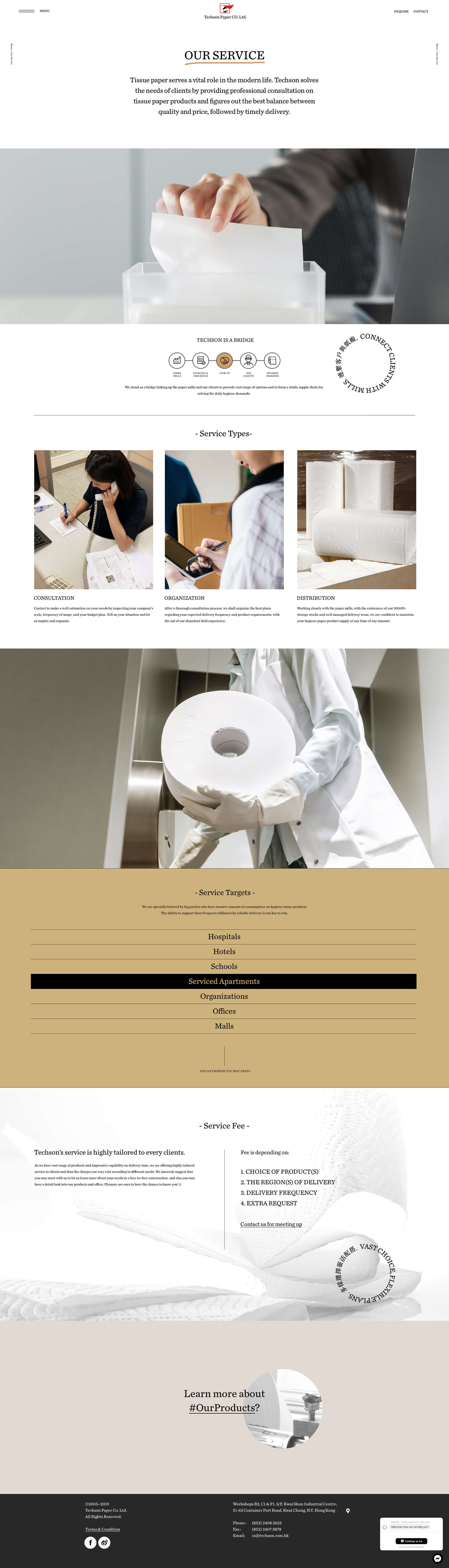
The website starts with a short brief: We want a charming website. And that's all. To make such an old and traditional business look young and attractive on the client website. We paid much attention to storytelling skills and layout design.
The layout of each page is always unique, which they never repeat in format, but still synchronized in style while having harmonic identity colors and creative animations. We have put a bit of "Brutalism Design" elements across the website as it is the latest artistic trend, and we love it.
We also catered to full copywriting. After deep conversations with the client, we extracted the strength and advantages of Techson and elaborated them into core values and visions. Some companies might usually say much about how great and aged they are. However, it is often just empty statements rather than practically explaining how these characteristics connect with their clients and usually lacks case studies. Therefore, our copyrights focus on skillfully explaining how the beliefs and habits of Techno would lead to high-quality services. We show factual figures and always clearly illustrate causes and results.
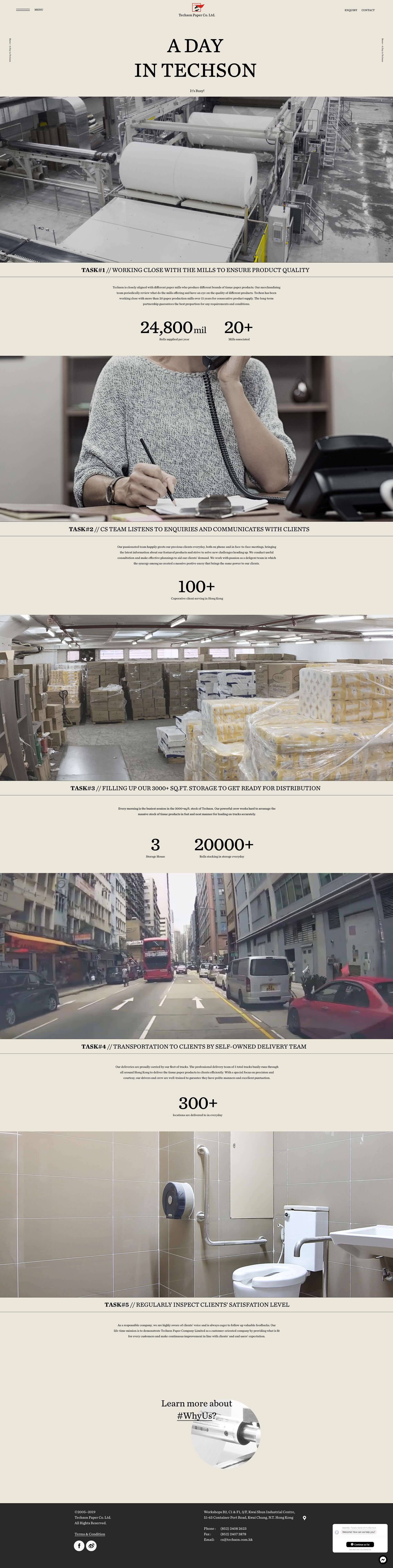
As we progressed the content, we found that videos may more transparently introduce the client's business. Therefore, we took a few days to shoot footage and combine them into an innovative section, "A Day in Techson ." The footage is the most important and eye-catching section because it connects with visitors by bringing the most realistic daily to their eyes, which can easily create a familiar feeling.
We hope you enjoy this confident portfolio that we proudly present to you.